Your community platform should be designed like a city.
Back in 2019, I had a real-life UX problem in Manchester, which led me to think further about how we should all be building our platforms.
In 2019, I had a real-life UX problem in Manchester, which led me to think further about how we should all be building our platforms.
It was a grey day in Manchester, and we had just watched Southampton FC lose 3-2 to Manchester United at Old Trafford.
All wasn’t lost, James Ward-Prowse scored THIS free kick.
When we left the stadium, we headed towards the nearest tram station, where two queues greeted us signposted 'Need tickets' and 'Have tickets'.
This felt very efficient, and I was somewhat impressed.
We entered the 'Need tickets' queue and waited patiently, noticing a few people turning back and wading through the sea of red football jerseys.
Once we eventually reached the front of the queue, we found out why: 'Tram tickets £4. Cash only.'
We were in England's third biggest city, visiting the tram station closest to their biggest public venue, only to queue and find out that it is cash only. Not only that, but you have to wait around a considerable length of time, only to reach the front of the queue and find out that your bank card isn't going to cut it here.
For all the locals, this wasn't a problem. They're used to it, a quirk they've likely encountered many times and prepared for ahead of time. As a tourist, this was something I was not expecting. If we were in the digital world, Google Analytics would have recorded this conversion as a failure.
Web applications should be designed like cities that receive a lot of tourists.
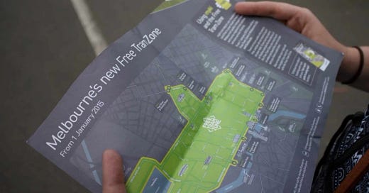
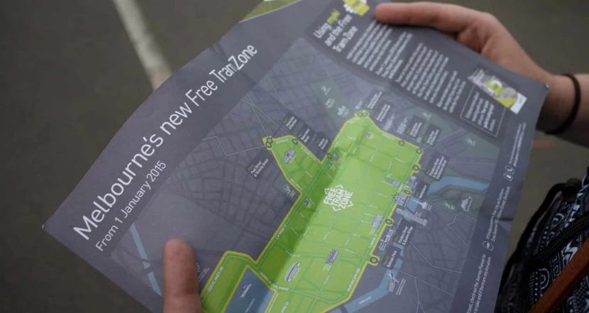
All cities have their quirks: Melbourne has a free tram system. In New York, the ferries are incredibly cheap. In London, you can use your contactless card as a ticket for the underground. (As a side note, the free tram system around Melbourne makes me want to visit again. Free transport around a city you don't know decreases stress for tourists five-fold.)
Our web applications reflect the individuality of a city's ecosystem, and we need to improve our ability to accommodate tourists.
When we think of our applications' members as tourists, we can start making design decisions that improve the member experience for everyone, old or new.
So, practically, how can we, as designers and developers, learn to do this better?
Talk to members. What is their biggest pain point? How can we solve this easily and efficiently?
Have a 'tourist-first' approach to design. Design and build in a way which informs and guides someone through your web application. Don't let them fill in a huge form, only for them to find out that it's 'cash only' (or more likely Paypal) at the end.
Stop. Review. Go. When working on a long-term project in its 12th phase, you often need to stop, review the situation, and proceed.
It's amazing how much impact one minor hurdle can have on whether a member sticks with your application or leaves to go elsewhere. Guide them through your city, showing them the best spots along the way, and they will be far more likely to return time and time.
Suppose there's one thing I've learned from my experience in Manchester. In that case, start simple, consider everything from an outsider's perspective, and then build your infrastructure around the member flow.


